When it comes to color, Procreate has some great standard palettes built right in to get you started, along with all the color selection tools you could ever need. But what makes a great palette, and how do you quickly create them so you can get on with the fun of painting? Try these tips the next time you need a unique palette that works, and try out with a little color adjustment for that finishing touch.
Pick a color, any color.
Before you start building a palette, lets take a look at the various ways you can select colors in Procreate. There are three different ways to select that perfect shade, plus a simple method for quickly finding harmonious colors to marry with colors you’ve already selected. Access these by tapping your Active Color and selecting the related tabs at the bottom the Color Panel.
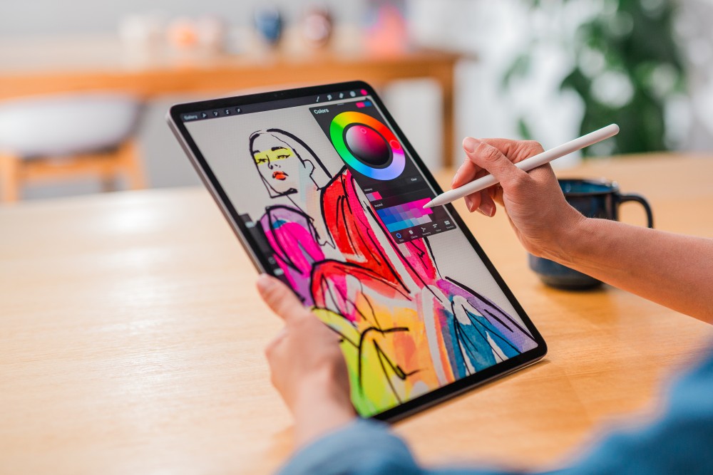
Disc in the Color Panel is the easiest way to select color.
Disc is the most approachable way to select colors if you are starting out. Classic is a more traditional take on digital color selection, using a standard square color picker to select your color's shade and hue, saturation, brightness sliders for finer control. Value is the most mathematical way of selecting color with HSB and numerical red, green and blue sliders, plus hexadecimal values commonly used in web design.
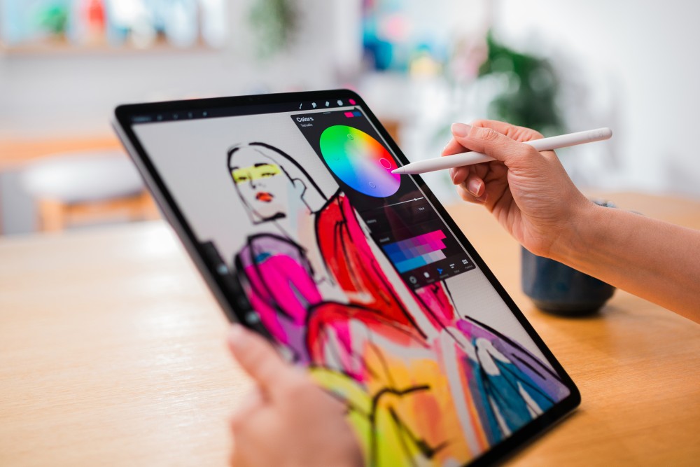
Harmony works a little differently from the other color selection methods above. Harmony uses a color you have already selected to offer various harmonious colors suggestions. There are five different Harmony modes you can use by tapping Complementary underneath the title Colors, these are Complementary, Split Complementary, Analogous, Triadic and Tetradic. Find out more about these Harmony modes in our Handbook.
Handpick and craft a perfect palette with Color Harmony.
Randomly selecting colors as you paint can give good results, but leaving things to chance may also lead to clashing colors that detract from your artwork. Remove the element of chance by using Color Harmony to quickly create a color scheme that is guaranteed not to clash.
To begin a new custom palette, head to your Palettes tab then tap + and Create new palette. Using Disc, Classic or Value select a color you’d like to use as one of the main shades in your artwork. Once you’ve selected a color you love, tap on the first empty swatch on your newly created palette to save it.
Tapping back on the primary color you originally selected, head to the Harmony tab and, using Complementary, you’ll see a color on the opposite spectrum to your primary color in the smaller reticle that will work harmoniously with your artwork. Add it to your palette and use the saturation disc add a few more shades for the new color.
Repeat this process using the harmonious color results produced by split complementary, analogous, triadic or tetradic until your palette is full. Remember to keep adding a few different shades for every new color.
The great thing about this method is you only need to select a single color you want to begin with to produce a palette full of colors from across the spectrum that all harmonize with each other. It also means you can get down to the fun part of painting in Procreate much faster and without spending time guessing what colors will complement each other.
Capture colors in real time when inspiration strikes.
19th century Impressionists captured light and moments in time by painting scenes as fast as possible. The colors and palettes they chose became more important than the detail in their gorgeous, loosely defined artworks. Today we carry cameras on us ready to capture those perfect moments when and where they happen, and thanks to Palette Capture you can turn these inspirational moments into an instant palette any Impressionist would be envious of.
Tapping + at the top of your Palettes tab and tap New from camera. This feature turns your iPad camera into an instant palette capturing lens, ready to gobble up the colors of anything you point it at. New from camera comes with two modes, Visual and Indexed. Indexed captures a palette from your entire iPad screen, and Visual captures just the colors your camera sees behind the on-screen Color Palette panel. Effectively, Visual offers a more condensed palette and Indexed a wider range of colors.
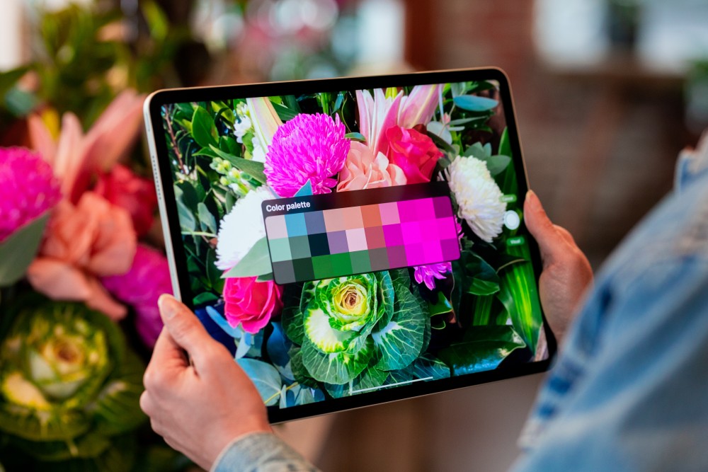
Palette Capture will build a palette from any image or environment using your camera.
You can also choose New from file or New from photos to create new palettes. This will take you to the Files or Photos app, where you can select an image or photo to create an instant palette based on the image’s colors. Now all the colors in those perfect sunsets and neon soaked night shots are yours to paint with.
The perfect finishing re-touch.
Have you ever finished a piece and felt like it could do with a little something extra? The finishing touch you’re looking for might be one of Procreate’s range of adjustments for boosting and altering the colors of you work. Adjustments work on an individual layer, so try swiping down on your canvas with three fingers to invoke the Copy Paste Menu and tapping Copy All followed by Paste. This will copy all your layers on the canvas, and then paste them as a single layer. Now you can experiment with color adjustments on the single layer, and still be able to make edits to your layered artwork below.
Hue, Saturation, Brightness is the most straightforward way to make adjustments to your color values, vibrancy and lightness using a simple set of HSB sliders similar to the ones found in the Classic color panel.
Color Balance gives you even more control by adjusting the Shadows, Midtones, and Highlights of your work using a set of color based sliders.
Curves is the most advanced color adjustment and contrast tool. Using nodes to adjust a set of curves sitting over a histogram comprising of red, green, and blue plus a combined gamma channel, this adjustment method will be familiar to experienced photographers and videographers.
Gradient Map applies a colorful gradient across your image for a stunning and instantaneous effect. Procreate comes with a gorgeous selection of built-in gradient palettes, or you can create your own custom gradient palette by tapping the + in the top right hand corner of the Gradient Library.
If you use Apple Pencil with Procreate you can apply any color adjustments as Pencil Filters for extra control. Swap between Layer and Pencil mode at any time to apply color adjustment across your entire image using Layer mode, then swap to Pencil to touch up isolated areas using Paint, Smudge or Erase. Pencil Filters work with any brush and can produce amazing effects and results.
There is no right or wrong way to color your work, and jumping in and having a play to find out what works best for you can yield some unexpected and amazing results that change the mood and atmosphere of your work.
The next time you’re inspired to create, don’t forget these handy and powerful tools to help you up your color game and give your piece the perfect finish.